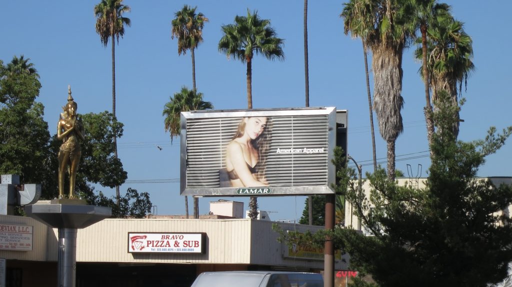
Lights! Camera! Los Angeles is where you can find the action. Beyond the bustle of…
8 Key Elements to Creating a Wonderful Billboard Design
Designing a roadside billboard for a massive audience seems like a difficult task, but with a little bit of mind mapping and a slight touch of creative magic, it can be easy when you adhere to this guide.
Simplicity
One Call to action
Fonts
Colors
Custom URL
Visuals
Mood
1. Keep it Simple. Seven words or less. (The Golden Rule)
Aside from gridlock traffic, commuters typically have 5-10 seconds to read a billboard as they pass by, depending on speed and distance to the road. Even if you are only trying to get your message across to people who are stuck in traffic, when utilizing billboard advertising, it’s always best to try and put something up that everyone can read, regardless of what speed they are going, and before they turn their attention to something else. Seven words is what our capacity is to ingest and remember a message in this environment. Brands getting too greedy with their amount of desired content is the biggest barrier to creating effective and impactful billboard creative.
2. Only put one call to action
To create the most effective billboard campaign it is important to be direct with where you want to drive your traffic. There is no need for you to put multiple ways to be contacted. Don’t forget the name of your brand or company is also a mild call to action where viewers can search for you online long after they’ve seen your ad.
3. Only use readable and large fonts
Making the perfect billboard means that you people onlookers to be able to read your message and for that message to leave a lasting impression. The smallest recommended height for lettering on a standard 14″x48″ billboard is no less than 24 inches for visibility at 500 feet away. So if the letters aren’t at least 2 feet tall, no one has is probably able to read it. In addition to font size, another good rule of thumb is to use Sans-Serif fonts (meaning a font without little feet). Sans-Serif fonts, like Arial, are more legible than Times New Roman.
4. Use bright and highly contrasting colors for fonts and backgrounds
Colors that have a sharp contrast, or pop against each other, are much more legible than those that blend together. Studies have shown that using highly contrasting colors can improve recall by 38%. Ultimately, the goal of billboard designs and an OOH advertising campaign is to improve brand recognition and brand awareness. To create a successful billboard, potential viewers must have an easily readable experience.
5. Ditch the phone number
Unless it’s a clever vanity phone number, URLs are more memorable and customizable. Even when people see a number, the first action they often take is to search for the company online. Typically consumers usually go to the company’s website to legitimize the business they are looking at before they call. An easy to remember URL will allow you to capture your target audience and immediately bring them into your other marketing channels. This way you can continue your marketing efforts by other means, increasing your ROI.
6. Only use one graphic/image concept
If you use more than one main image for your billboard ad, you create twice as much noise. A picture is worth a thousand words, and there’s no need to get two thousand in there. It is just too much and too distracting from any message you’re trying to convey.
7. Don’t be BORING
No matter what your style is, try to get out of your comfort zone, and do your best to be memorable. The key to any billboard advertisement or OOH Advertising campaign is recall, your message has to be remembered. Obviously don’t push things too much that could cause a car wreck. Be sure when you start your creative process to always keep this in mind when constructing your message.
8. Take Advantage of Location
A crucial billboard design tip is to take the location of your billboard into consideration. Creative designers and professional designers might look to poke fun, or take advantage of the local setting when creating their billboard ad. This can be an effective way to improve brand recognition or when creating a brand identity.


