Lights! Camera! Los Angeles is where you can find the action. Beyond the bustle of…
No matter what business you are in, you may have considered using advertising devices like billboards to advertise. Billboard advertising is a type of out-of-home promotion that uses large structures along busy roads to catch the attention of drivers and pedestrians. Billboard ads can be an effective way to reach your target market, but they need to be done right for them to work hard for you. Here are eight essential rules for billboard advertising.
1. Choose the Right Location
Do thorough research to know how billboards are made and what kind of demographics live or work near your target location. Think about how often people in the United States travel on the roads near your target location. Are there any events happening near your target location that could attract a larger than usual audience? This way, you rest assured that you reach the right traffic patterns. Again, if you want to reach commuting people, make sure your billboard ad is visible from both directions.
2. Use Images That Will Stand Out
Billboard ads are all about getting noticed, and one of the best ways to do that is by using images that stand out. A picture is worth a thousand words, so choose wisely! Whether it’s a beautiful landscape or a close-up of a product, ensure the image is high quality and will grab the attention of people driving by. When exhibited on a big canvas, like billboards, grainy and fuzzy images will look unattractive. Billboard images should, as an outdoor advertising rule, have a resolution of no less than 300 pixels per inch.
3. Use Appropriate Designs
This is one rule for billboard advertising that most companies usually don’t follow. Yes, doggies and kittens are adorable; however, don’t display them on billboards unless you’re a pet supply firm. Use a product from your line to feature on your advertising sign or an image that is instantly recognizable as belonging to your company.
4. Be Vibrant
Use vivid hues or striking images in your billboard design to draw attention. Contrasting colors within the layout will also make a stronger effect and improve message retention. But to guarantee that the foreground doesn’t compete for the viewer’s attention, keep your background simple. Also, limit yourself to a single, sizable image or photo. Compared to a group of photos that individually occupy a quarter of the billboard design, that one dynamic image will have a considerably greater visual effect.

5. Keep Your Message Clear and Concise
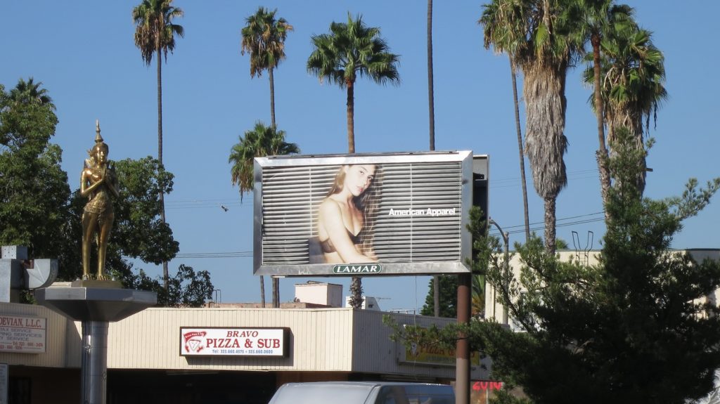
With only a few seconds to capture attention, your billboard advertisement copy should be short, sweet, and to the point. If you’re thinking of putting up a billboard in a high traffic area, such as a billboard in Hollywood, it is important to remember that people don’t have much time to absorb messages because they’re moving when reading them. The suggested industry standard for reading a billboard advertisement is six seconds.
Therefore, you should only utilize about six words to convey your advertising sign message. As a general guideline, less is more in this case, though you can extend it to another few words depending on their length and readability. A single, clear message is more likely to stick with people than a complex one.
6. Reduce Boredom
Entertain your audience. Encourage customers to learn more about your company by letting your messaging pique their curiosity. For instance, you can look for any trending phrases and try incorporating them on your funny billboards. Creative ads always succeed!
7. Have More Than One Billboard
One billboard may be costly, but neither is it effective. Billboards are a mass-market medium. Therefore, you want more than one to target as many people as possible. Every billboard receives a Gross Rating Points (GRP) score depending on factors like traffic, visibility, location, size, etc.
You receive a showing score from 1 to 100 based on this rating. That means that at least half of the local population has seen your boards daily. Your chances of having an impact are higher if you only have four to five boards than if you have just one. A 100 showing would be ideal for you, but it will cost you a few more bucks. On the other hand, a 50 showing for one month will cost you tens of thousands of dollars depending on the location—the cost skyrockets in a huge city like New York.
8. Include a Call to Action
This last rule is a must-follow in billboard advertising. You want your ad to grab attention and encourage people to take the next step. Make sure your contact information is prominently displayed- since you want people to be able to reach you!
Make People Stop In Their Tracks by Renting a Billboard With Us!
You only have a few seconds to make an impression, so make it count by contacting an advertising pro! At True Impact Media, we make eye-catching and memorable ads that will increase your OOH and billboard marketing strategies. Feel free to contact us today!
Sources:
Graphic Design Forum. Image sizing for billboards
https://www.graphicdesignforum.com/t/image-sizing-for-billboards/5293
PSA Research. Tips for Great Billboard Advertising
Marketingprofs. What is a GRP, and how is it calculated?
https://www.marketingprofs.com/Faqs/showfaq.asp?ID=134&CatID=1


