Lights! Camera! Los Angeles is where you can find the action. Beyond the bustle of…
Billboard advertising has always had a special place in marketing strategy. The billboard advertising cost is not as high as mainstream media commercials, they aren’t ignored or ad-blocked like online ads, and roadside billboards are often a source of entertainment on a long road trip or a regular commute. While remote work has reduced daily commutes, take a drive and you will see hundreds of people still performing necessary transport tasks, running errands, and taking private pleasure drives.
How successful is billboard advertising in 2022? About 71 percent of consumers often look at billboard ads, and 78% of consumers are commuting at least part-time in 2022. In addition, people are actually spending more recreational time outside, traveling in private groups to beaches, parks, and vacation rentals to avoid cabin fever at home. Billboard ads are seen by the drivers of business fleets and the thousands of people already commuting again in on-site and hybrid jobs.
The most important element of effective billboard advertising today is to be memorable. When a potential customer remembers your brand, purpose, or tunes in for another look on their next trip, you have their attention. There are many advantages of outdoor advertising such as billboards. Once you learn how to effectively create a billboard, you can gain brand awareness and customers. Let’s dive into the 15 best tips for successful billboard campaigns in 2002.
First Strategy, Then Design
- Start with the Strategy
A billboard campaign is not just an image or a message, it’s an experience. You must consider the literal “buyer journey” as a potential customer drives up with the billboard ad in view, notices the billboard, and seeks to understand it in a few minutes – without taking their eyes off the road.
Your billboard ad is part of the terrain and set with a backdrop against the sky, trees, or nearby cityscape. Based on the road and location, there is an approach time, a viewing angle, and even the sun’s path to consider. To make an effective billboard advertising campaign, first, you build a strategy. Then your billboard strategy will shape the design.

Billboard Message and Visibility
The next stage is working on the billboard design, specifically messaging and visibility. Consider the message you want to send and how to make it clear in a quick glance. Consider how long drivers have to see your billboard and what you can convey in that time.
2. Designing an 8-Second Message
Drivers have an average of 8 seconds to view a billboard on their way by. This means that your billboard advertisement must take no longer than 8 seconds to understand. Pictures, symbols, colors, and words; it all needs to make sense in a short drive up and phasing through the driver’s view. Simple is better, both in design and concept. If you must use words, keep the word count to a minimum.
You can find the exact range of seconds that drivers will see your billboard by timing your own drivers passing that spot in the flow of traffic.
3. A Picture is Worth 1000 Words
Show, don’t tell. One or two large words can make a difference, but there’s no room for explanation. “Luxury. Beach. Brand Resorts” or easy phrases like “Your Baby Deserves the Best” are about as much written message as you can fit on a billboard – for both visibility and reading time. But an image can convey much more. Use clear outlines, high contrast, and minimal reliance on shading, which can fade or lose detail in the weather.
4. Keep It Simple and Clear
Clarify your message. What are you trying to convey? Show your viewers in the simplest way possible. Choose one or two focal images and one or two words of text as your baseline. Whether your style is funny, serious, or mouthwatering, give your viewers a clear idea of what the billboard is telling them – and what they might do if they like the billboard design.
5 – Bonus Tech Tip: Test Distance & Angle Visibility in a Virtual Space
How do you know if your billboard design is visible driving up, at an angle, or with the sun behind it? Virtual rendering is a great way to create a simple 3D environment and test distance & angle visibility of your design. Render your billboard design on a vertical plane, then move your perspective to view it from different angles. This is a great way to design cool visuals, pop-outs that look good from all angles, and plan for roads that are not 100% aligned with your billboard campaign.
Billboard Location and Design
The location of your billboards is one of the most important decisions you will make. We mentioned that your billboard becomes a part of the terrain, and this means location shapes both how viewers approach and how your design stands out in the surroundings.
6. Calculate the Best Locations
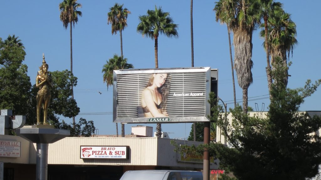
Consider the best locations for viewers. For example, if you’re looking for Sacramento billboards, the commuter and transport main routes are a good choice, especially to catch rush-hour traffic, however if you need a Hollywood billboard, your brand may benefit more from focused marketing on tourist routes. Some billboard locations are closer to the road and some of them are raised higher into the air. Some are on an interesting landmark feature like halfway up a hill or on the side of an old brick building, and some billboards are poorly placed.
Always consider the location carefully when choosing a billboard and your billboard size. The location is important not just for the traffic flow, but also for your ability to strategize the location to its greatest potential.
7. Consider Color vs the Surroundings
Will your billboard stand out in the surrounding color palette? A billboard of a sunny beach stands out against a canopy of trees along a forested highway, but not against the amber glow of the Arizona desert. A red brick background to your billboard will be striking against the open sky, but blend into a brick building location. Your billboard’s surroundings can and will influence how it is seen – so you might as well build these colors and details into your billboard design strategy.
8. Incorporate the Landscape and Local Conditions
What about the landscape itself? If your billboard is halfway up a hill and jutting out of the rock, the silhouette of mountain climbers might be the perfect eye-catching design. If your billboard appears as drivers come around a corner, draw a peering creature to “creep out” and say hello. This is a fantastic way to surprise and delight your viewers while also showing a level of awareness and strategy rarely seen in public marketing. Locals, especially, will love when you work with local terrain, weather, plant life, and other conditions that define the roadways.
9. Work with the Weather
What is the weather like around your billboard? On a road where there are always clouds or rain, consider featuring figures under an umbrella with sun on the underside. On a sun-drenched highway, the image of shade and cooler colors may be more appealing. You might even design a sign on a windy highway that looks especially good or interesting when waving in the wind.
10. Sequential Billboard Design
One of the most attention-grabbing ways to use the terrain is a sequence of billboards. Each of them has its own 8-second viewing timer, and you can say more in a cumulative message. Some create optical illusions with three billboards that become one and separate when passed. Many middle-of-nowhere truck stops use a row of enthusiastic billboards to wake up sleepy truckers and invite them to hot coffee with breakfast.
If you have a large, open stretch of highway, a sequential billboard design can be fun, engaging, and surprising conversations with consumers on their drives.
A Lasting Impression
Finally, the most important thing about successful billboard advertising is memorability. After a driver has seen your billboard, what do they remember? Do they remember your brand, colors and symbol? Do they remember that there’s a hotel and restaurant at the next exit? Do they remember that baby vaccinations are available at local Memorial hospitals? Did their passenger snap a picture? Here are a few strategies to boost your billboard memorability and leave a lasting impression.
11. Eye-Catching without Distraction
Find ways to catch the eye without causing a road distraction. This is a delicate balance best exemplified by the Chick Fil A cows. Yes, those were “cows” “painting” signs. Yes, some of those cows were plastic molds, and standing on each other’s backs. It was interesting, but it was also easily understood and didn’t cause cars to veer toward the billboard. Bold colors, an interesting image, and contrasting with the background are good eye-catchers, while magic-eye illusions probably are not.
12. Pop-Outs and Cut-Outs
Speaking of the chick-fil-a cows, one of the best ways to make a driver look twice and remember your billboard later is to change the billboard format. Cut-outs so that sky can be seen behind and pop-outs like the chick-fil-a cows cause a “what is that?” response as the eye sees parallax where it expects a solid rectangle. If the driver doesn’t understand in their 8 seconds the first time, they’ll often remember to look again on their way back through – and to watch for other similar signs to see if they also have cut-outs or pop-outs.
13. Direct vs Indirect Calls to Action
What do you want your viewers to do when they remember the sign? A call to action can be direct or indirect. Mentioning baby vaccinations is all it takes to remind young parents to book their next infant appointment, but you might invite drivers to take the next exit to your restaurant. Just one-word associations like “massage” or “taxes” can help viewers take action later based on your billboard.
14. QR Codes for Passengers
A rising trend in billboard design is a QR code that can be recaptured from dash caps or snapped by phone-wielding passengers. This QR code OOH strategy interesting idea and often best implemented on slower or stop-and-go roads where high-speed phone use is not a risky side-effect. QR codes can quickly turn a visual asset, like a billboard, into a linked app or landing page and the online conversion funnel.
15 – Bonus Tech Tip: Multi-Touchpoint OOH Marketing
For our last and most advanced tip, consider chaining your billboard marketing design with other outdoor advertising methods like shopping center kiosk banners, signs on walking paths, and the signs used in your brick-and-mortar locations. Consider a driver who heads to the mall and sees your billboard for hiking shoes along the way. They reach the mall and see another hiking shoes advertisement and realize your store is in their mall. They wander until they see a similar design outside a store and go buy hiking boots. Multi-touchpoint marketing can even reach into the digital marketing world by creating an identifiable campaign that users can follow like a rabbit trail to deals, products, or services they became aware of on the road.
Successful Billboard Advertising Campaigns Start with Strategy
Successful billboard advertising is all about knowing your location, audience, and how to deliver your message in 8 seconds or less. If you are looking to advance your OOH and billboard marketing strategies, contact us today.
Sources:
3. https://penji.co/billboard-advertising-guide/
4. https://www.vcoutdoor.com/blog/billboard-trends-for-2022


