Lights! Camera! Los Angeles is where you can find the action. Beyond the bustle of…
In some ways, a minimalist billboard is out-of-home (OOH) advertising in its purest form. With an eye on saying it all with as few words—or any other elements—as possible, minimalist billboards offer consumers creative, arresting, and highly effective ads they may recall for years to come.
Are you interested in learning more about minimalist billboard design? Keep reading for what it is, why it’s hot, and what it could do for your business.
What Is a Minimalist Billboard?
Some of the most memorable and effective billboard campaigns in recent memory adopt the tropes and trademarks of minimalism to craft seemingly bare-bones advertisements that nevertheless manage to engage, enthrall, and influence consumers. From national to hyperlocal advertising, these ads shun extravagance and excess in every aspect of billboard design, including:
- Branding
- Color
- Content
- Text
Minimalist concepts hit the world in the late 1950s and early 1960s, becoming an aesthetic “movement” that would touch myriad creative or aesthetic fields, from painting and visual art to literature, film, and theater. Minimalism affected advertising as well, as it heavily involves creative work and the eye-catching simplicity was a perfect match.
There is no static definition of what a minimalist billboard is precisely, but these ads are generally characterized by the following qualities:
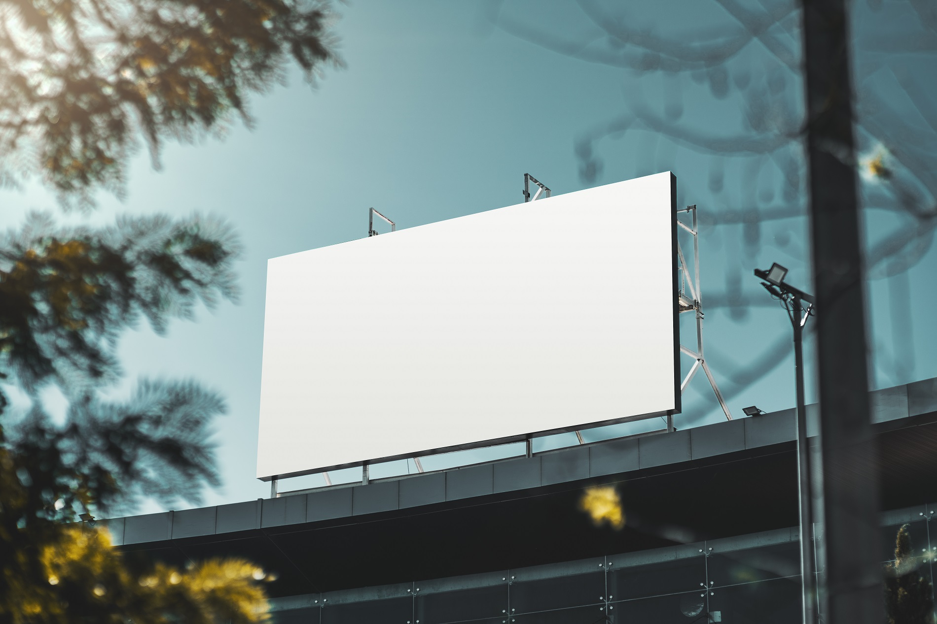
- Liberal use of white and/or negative space
- Minimal text
- Minimal graphics and/or images
When billboards are scrubbed of their most powerful and influential factors, like color, image, and text, designers get to work developing new techniques and ideas for creating unique, billboard ad campaigns that are compelling to consumers even as they go easy on embellishments.
But don’t let the streamlined design fool you. Minimal billboards may lack the kaleidoscope of colors and vibrant images you might usually associate with a traditional billboard, but they can still have a maximal impact.
The art of minimalist ad design is in distilling what’s most remarkable about a company, product, or message into an ad that’s succinct, direct, and persuasive. When it’s done well, a minimal billboard is sleek, self-aware, and sophisticated, offering your target audience just enough information to pique their interest, drive up engagements, and boost business.
Discover our other trending billboard facts before getting started on your outdoor ad campaign.
Three Ads That Perfected the Minimalist Billboard
Advertisers have been producing minimalist billboards that are just as effective as their more boisterous counterparts for decades. The history of advertising is replete with examples that run the gamut from the imminently iconic to the largely forgotten.
But there’s little chance of a truly effective billboard getting swept into the dustbin of history. Here are three 21st-century examples from famous brands that will always be remembered for how they maximize the potential of minimal billboards:
- Apple, iPhone X campaign – Apple is a brand with international recognizability that has made minimal its go-to aesthetic nearly since the company’s inception. And over the years, we’ve seen no shortage of minimal ads from the brand, including the highly effective billboards for the release of iPhone X in 2017. These spare posters featured the iPhone X set face down on a sea of pure white with no more text than the name of the phone, its release date, and Apple’s emblematic logo.
- Coca-Cola, “The Sign” – In early 2020, Coca-Cola took minimalism to the extreme for an Italian campaign. Their minimalist billboard featured an expanse of could-only-be-Coca-Cola-red and, at the near-perfect center of the poster, the brand’s logo, which was gently curved at each end to suggest the shape of Coke’s iconic soda bottles. Hovering a short distance above was the brief message, “Feel it.”
- McDonald’s, “Follow the Arches” – McDonald’s 2018 “Follow the Arches” campaign leaned into minimalism so hard that the ads even dispensed with featuring the fast-food giant’s signature Golden Arches logo. The series of billboards featured only fragments of the Arches accompanied by succinct directions like “On your left,” “On your right,” “Next exit,” and “Just missed us.”

What Are the Benefits of a Minimalist Billboard?
Aside from a design style that feels fresh and contemporary, giving your billboard ad campaign a minimalist make-over could come with the following benefits:
- Easier viewing – Because minimalist billboard design often features little more than a logo and the briefest of messaging, motorists can engage with the entire ad more quickly. And with comparatively little to digest, they may spend more time looking at your simple, yet effective billboard. Simple digestibility is crucial when motorists only have an eight-second view of your ad.
- Increased memorability – Because of the creativity required to make the constraints of minimalism a boon instead of a barrier, consumers may find a minimalist billboard more memorable.
- Increased brand recall – Consumers may be more likely to remember a simple billboard because of its ingenuity. They may also be more apt to remember your business if your ad impresses, delights, or intrigues them.
How To Go Minimalist With Your Billboard
Designing a minimalist billboard that reaches its target audience isn’t a task for the uninitiated, especially when it comes to running a successful billboard advertising campaign. If you don’t have a history in graphic design, working with a design team or trusted company experienced in outdoor advertising is paramount.
However, anyone designing an outdoor billboard should keep each design tip below in mind:
- Know your brand and product
- Prioritize brevity and concision
- Make it unique and compelling
True Impact Media—Minimal Hassle, Maximum Returns
Crafting the perfect minimalist billboard is only the first step to launching an OOH campaign that connects your business with the customers you’ve been looking for. The second step is finding the perfect billboard location and better understanding why it’s crucial to your success.
Meet True Impact Media. Our media buying platform offers a trusted and transparent way to launch a new campaign or amp up your current efforts. Getting started is free. Contact us today.
Sources:
City Spidey. The Power of Minimalistic Advertising. https://www.cityspidey.com/news/14409/the-power-of-minimalistic-advertising#
Mac Rumors. iPhone X Billboards Appear in Toronto, London, Tokyo, and More Cities Around the World [Updated]. https://www.macrumors.com/2017/10/11/iphone-x-billboards/
Muse By Clio. Coke’s Iconic Bottle is Instantly Recognizable Even In These Ads Where It Disappears. https://musebycl.io/advertising/cokes-iconic-bottle-instantly-recognizable-even-these-ads-where-it-disappears
Ads of the World. McDonald’s Follow the Arches. https://www.adsoftheworld.com/campaigns/follow-the-arches
Chron Small Business. Minimalism in Advertising. https://smallbusiness.chron.com/minimalism-advertising-69504.html
Fits Small Business. 21 Creative Billboard Design Ideas & Tips. https://fitsmallbusiness.com/billboard-design-tips/


